
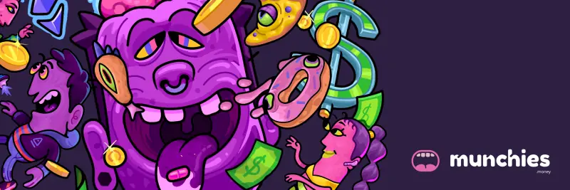
Munchies

For Munchies, we started from one idea: a menu instead of a chart. From it we designed the dishes that became characters, the illustrated world, the landing page and the app interface.
Characters
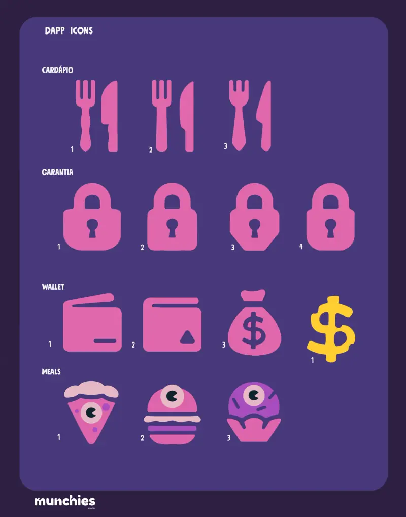
We turned each vault into a dish.
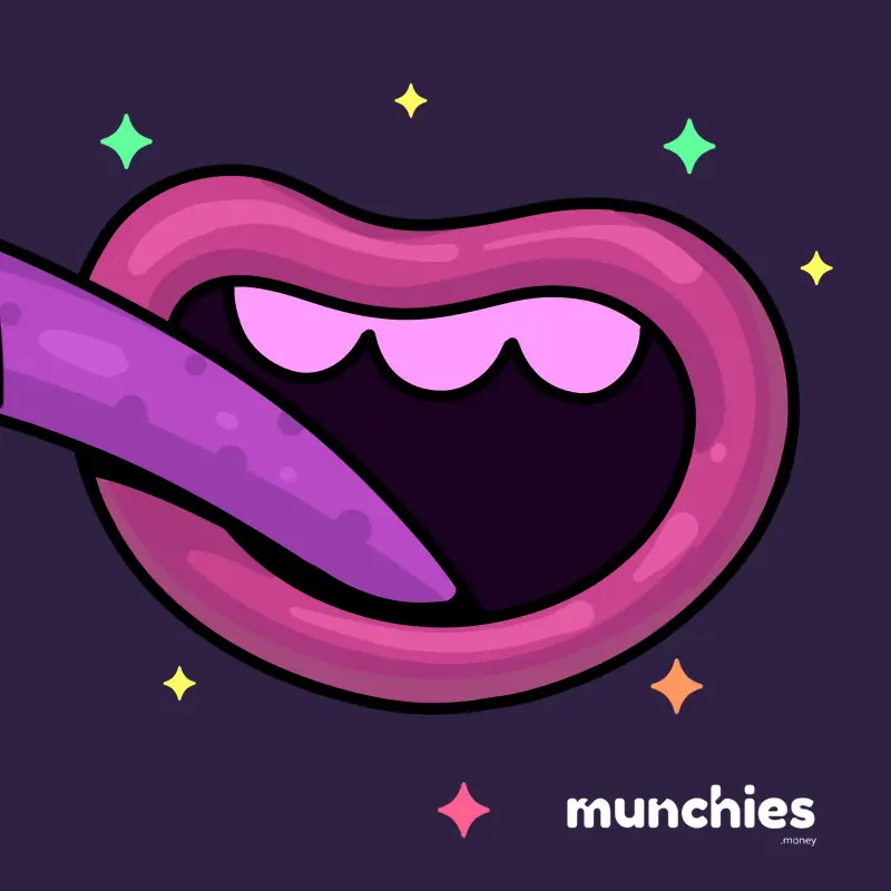
Burger, pizza and brigadeiro: each vault in the app got a character with its own animation, and the brand’s mouth changes mood with every status.
In motion04
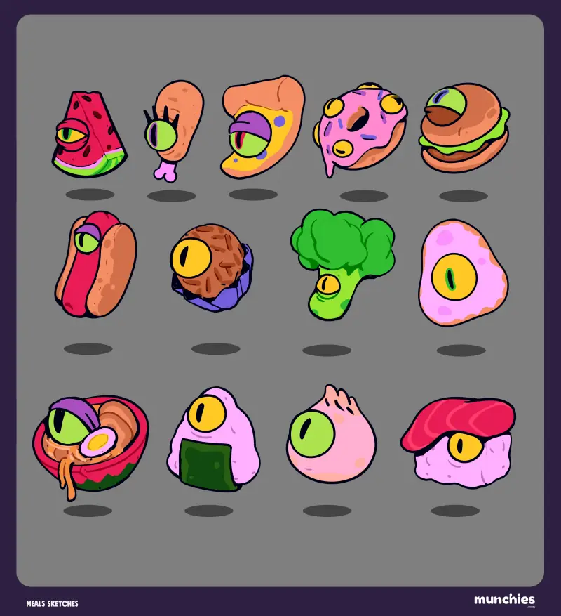
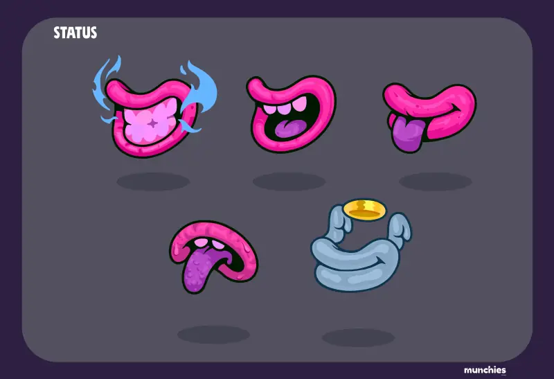
The character menu, ready to grow with new vaults, and the brand’s mouth in five moods, one for each wallet status.
Illustration
We drew a whole world around the menu.
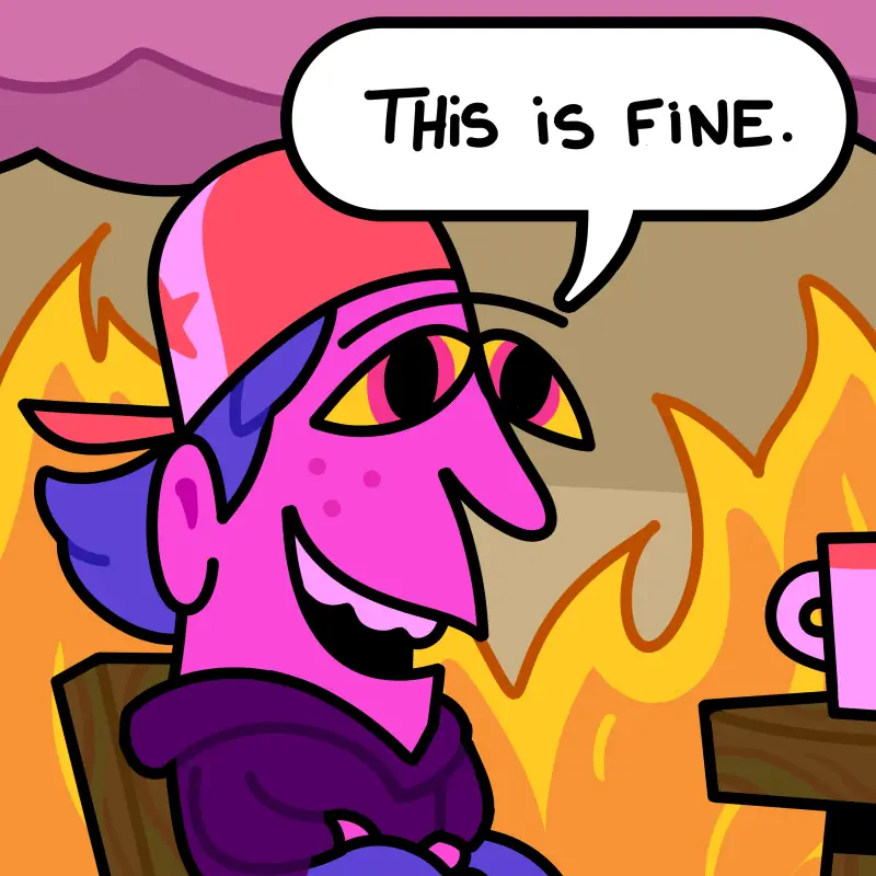
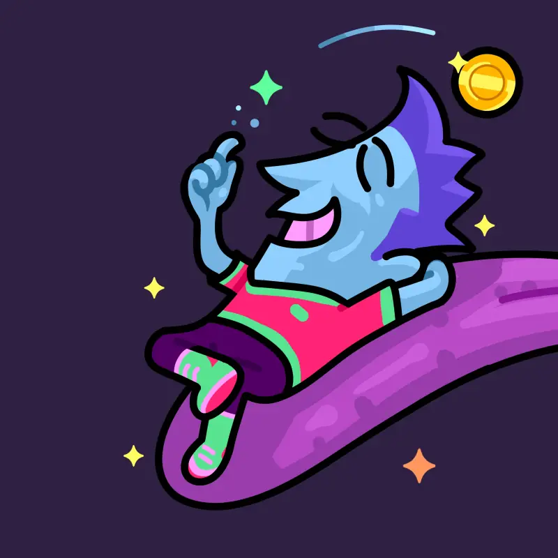
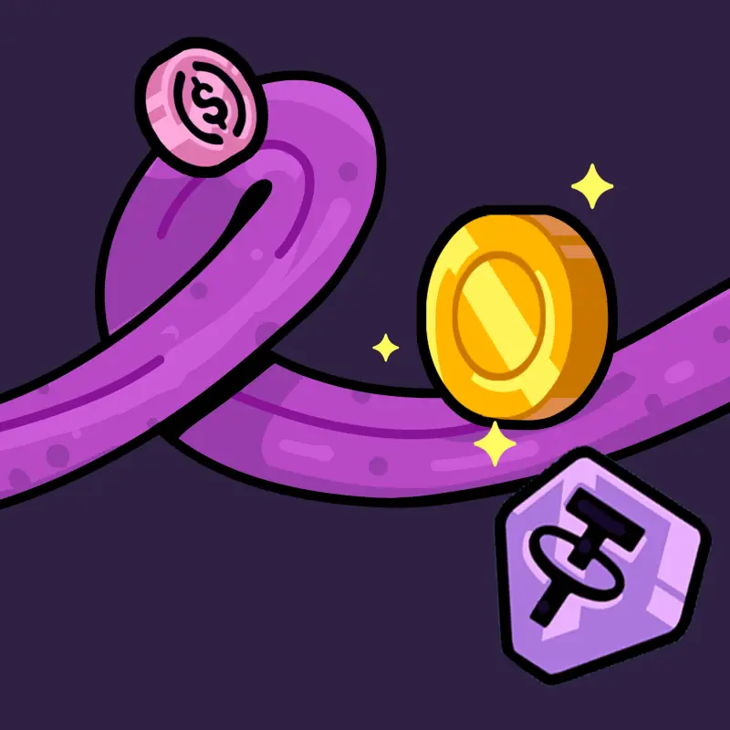
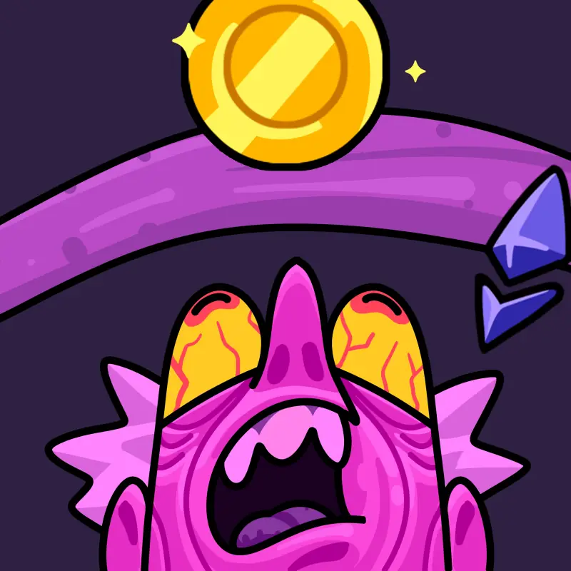
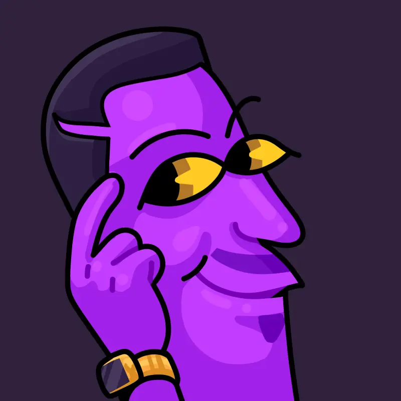
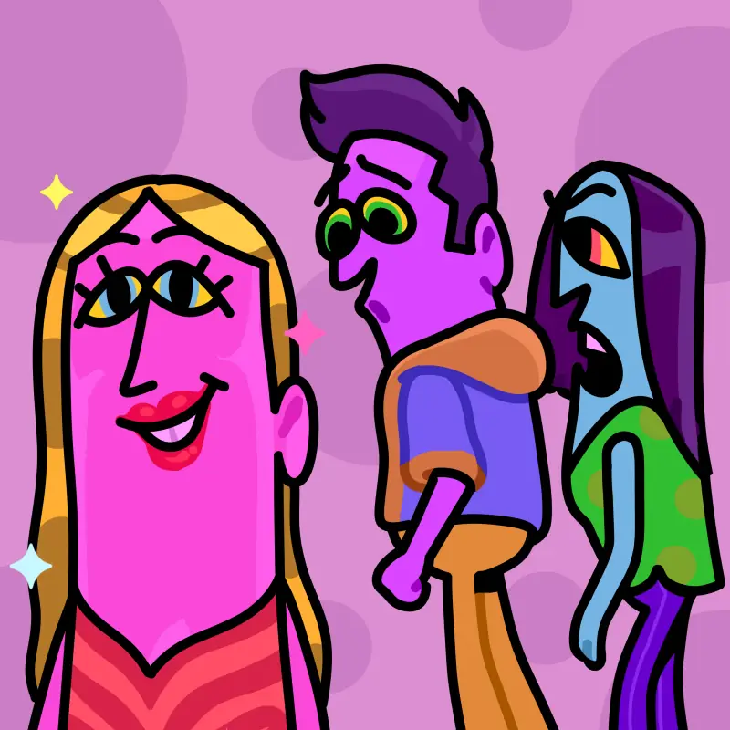
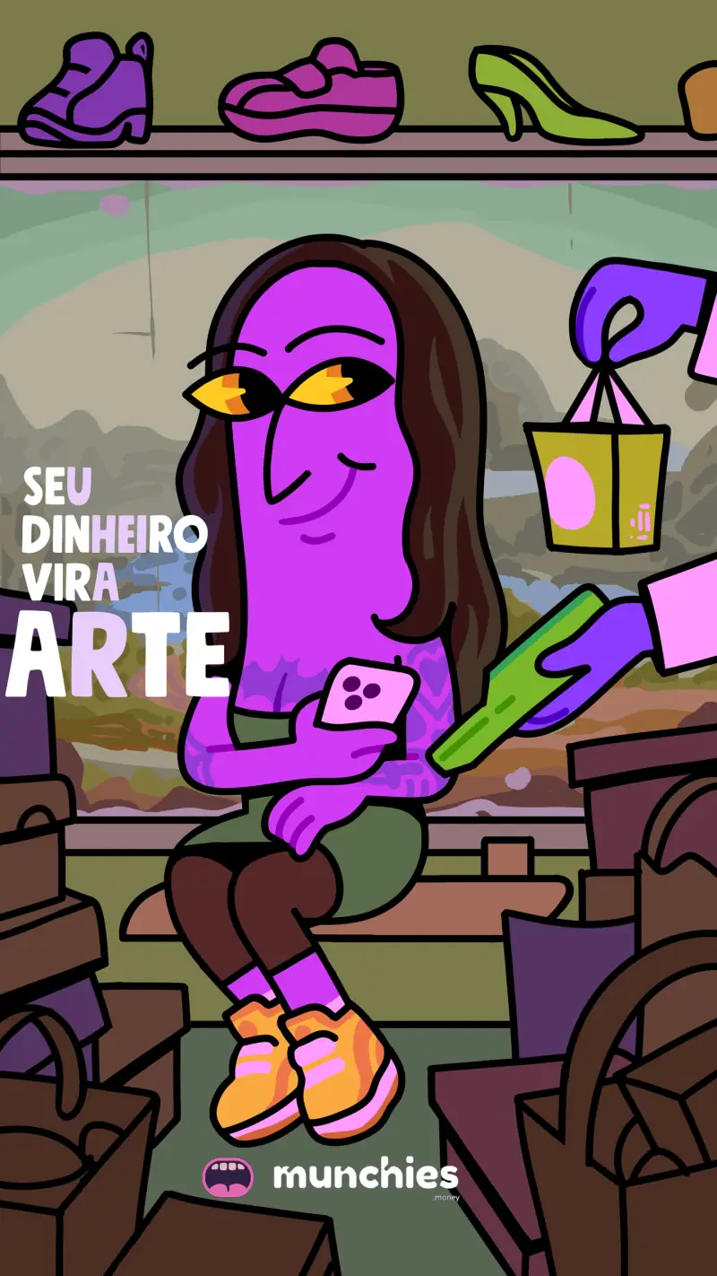
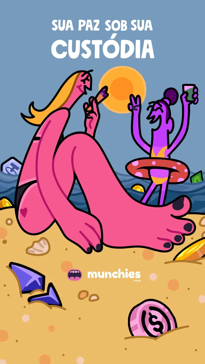
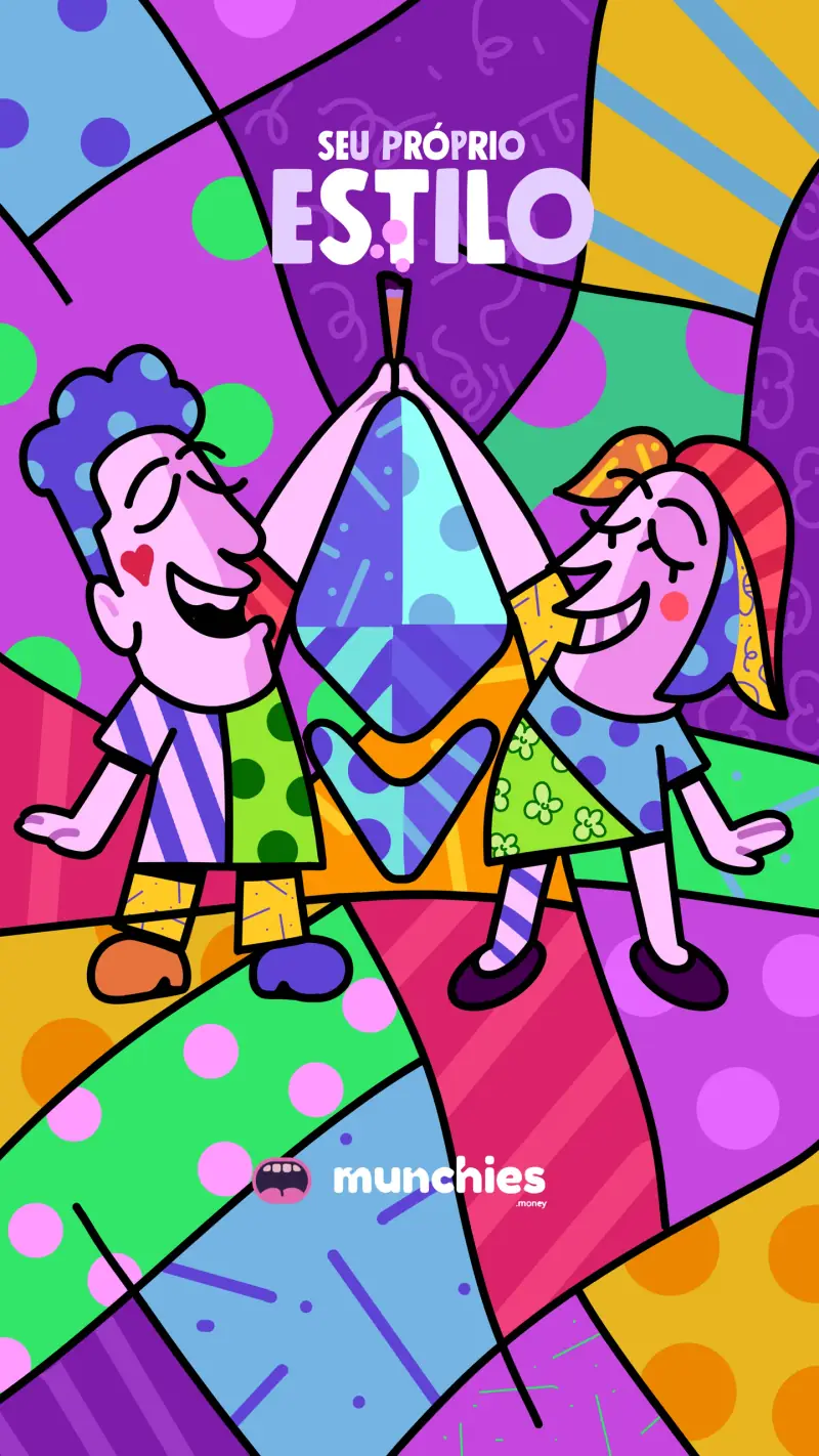
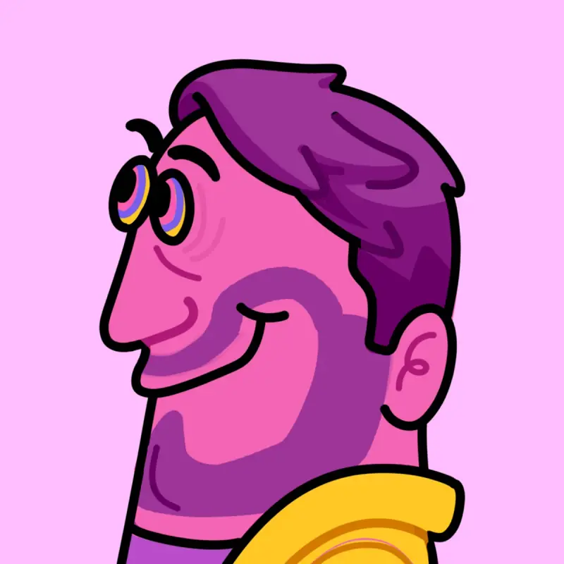
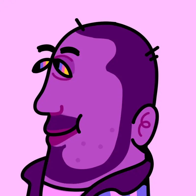
Posters, stories and social covers in the same thick line and colors as the app. Even the Munchies team became characters.
Posters08
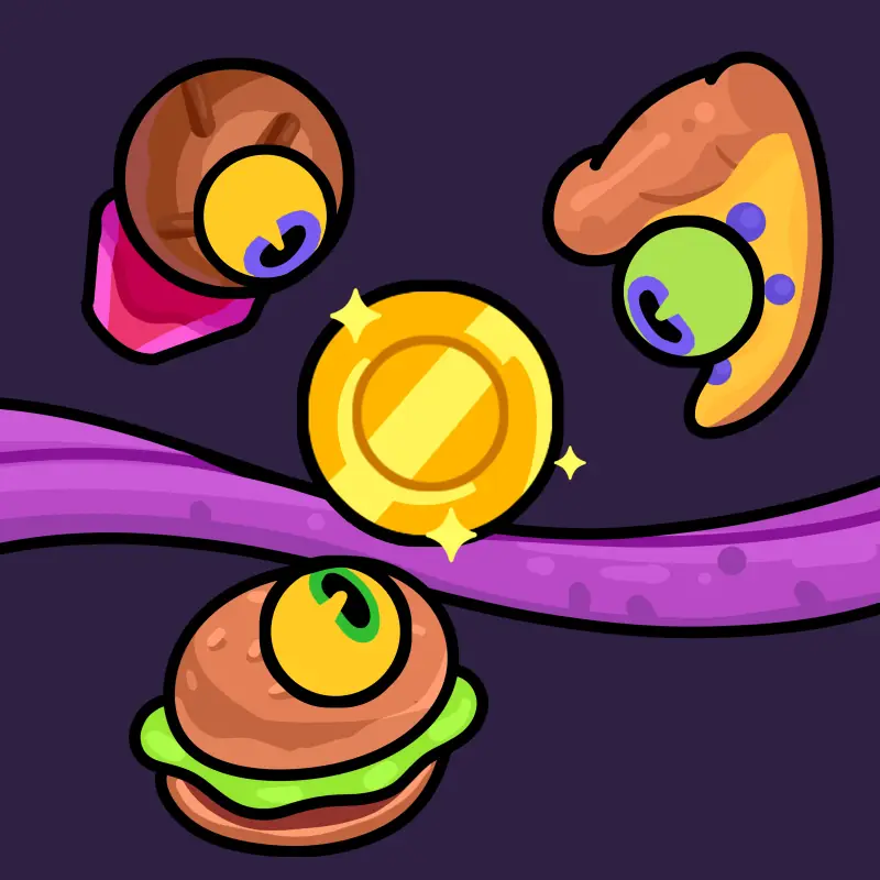
Stories04
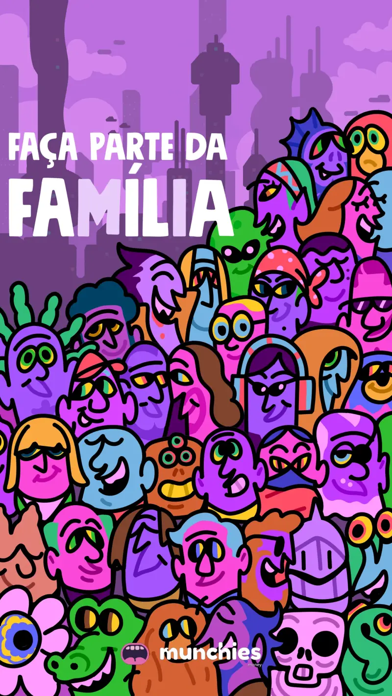
The team, in the brand’s line07





App
We designed the app for people who have never opened a crypto wallet.
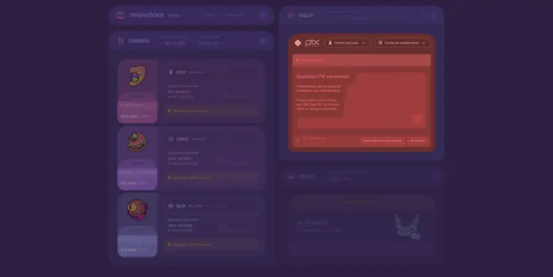
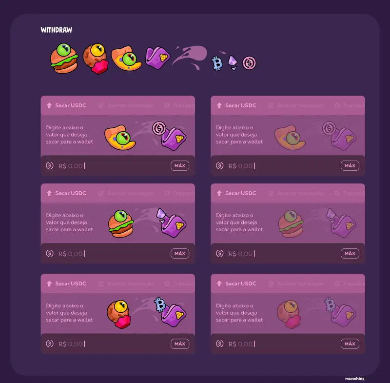
We did the UI/UX of the whole app: vaults become dishes, Pix comes in and out through three status screens, and every step of a transaction has its own color and character.
The main screen in motion: the dishes and the mouth react to the collateral status.
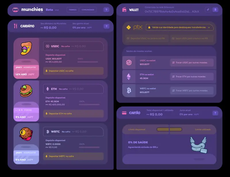
Pix: deposit, withdrawal and failure03
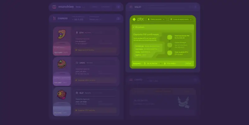
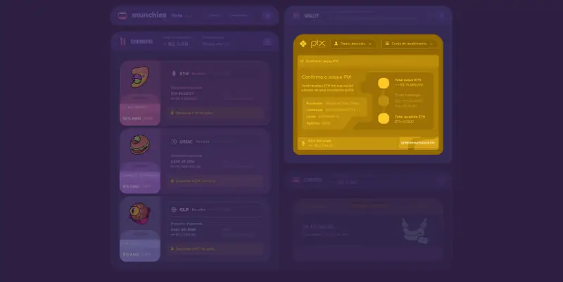
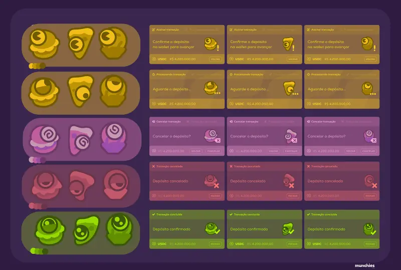
Every step of the transaction got its own color and character.
Site
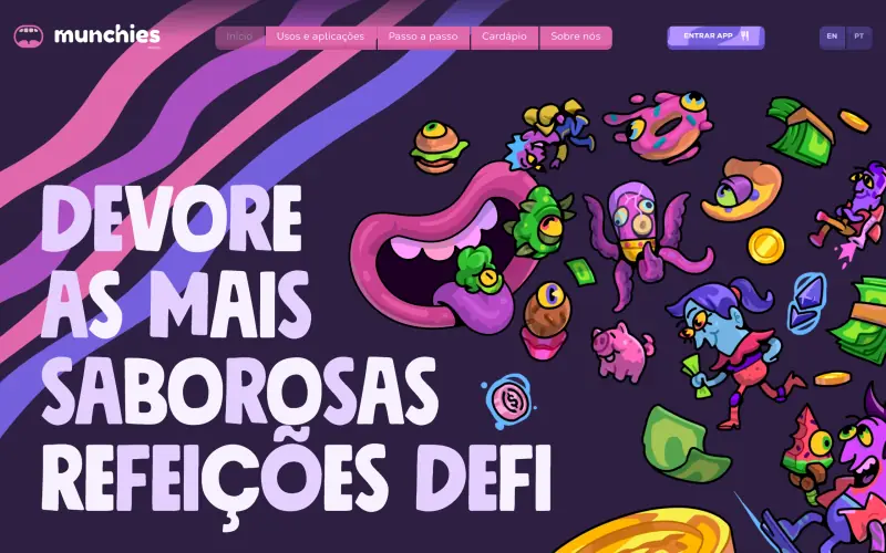
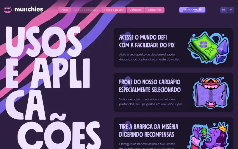
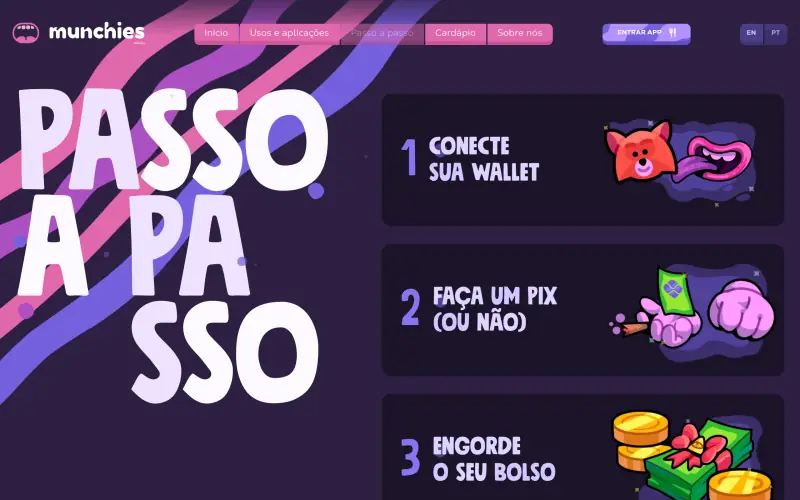
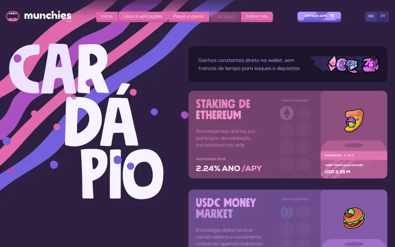
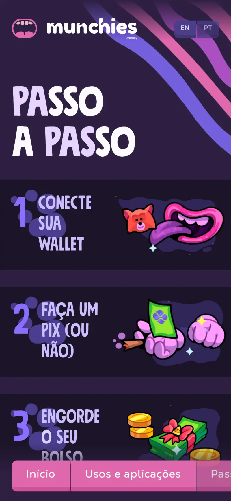
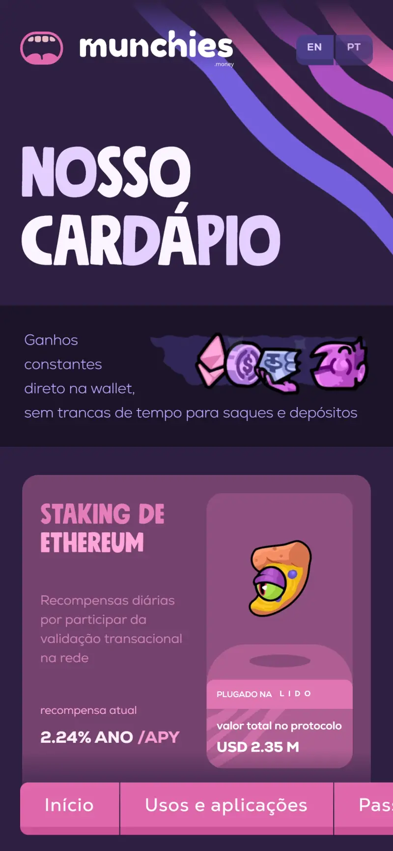
We designed the landing page that serves the menu.
From the hero to the team, every section brings a dish or a character, on desktop and mobile.
The live site, browsed in real time: the mouth spits out the menu on load and swallows it back on hover.
Site screens06
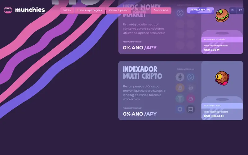
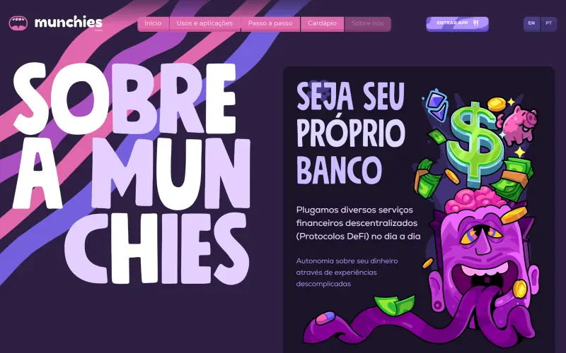
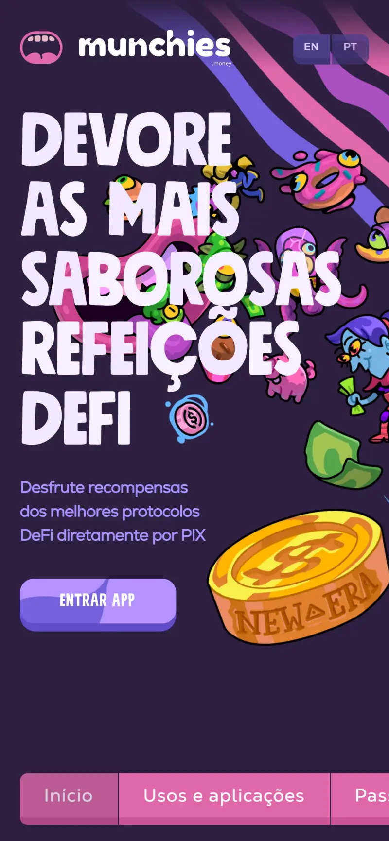
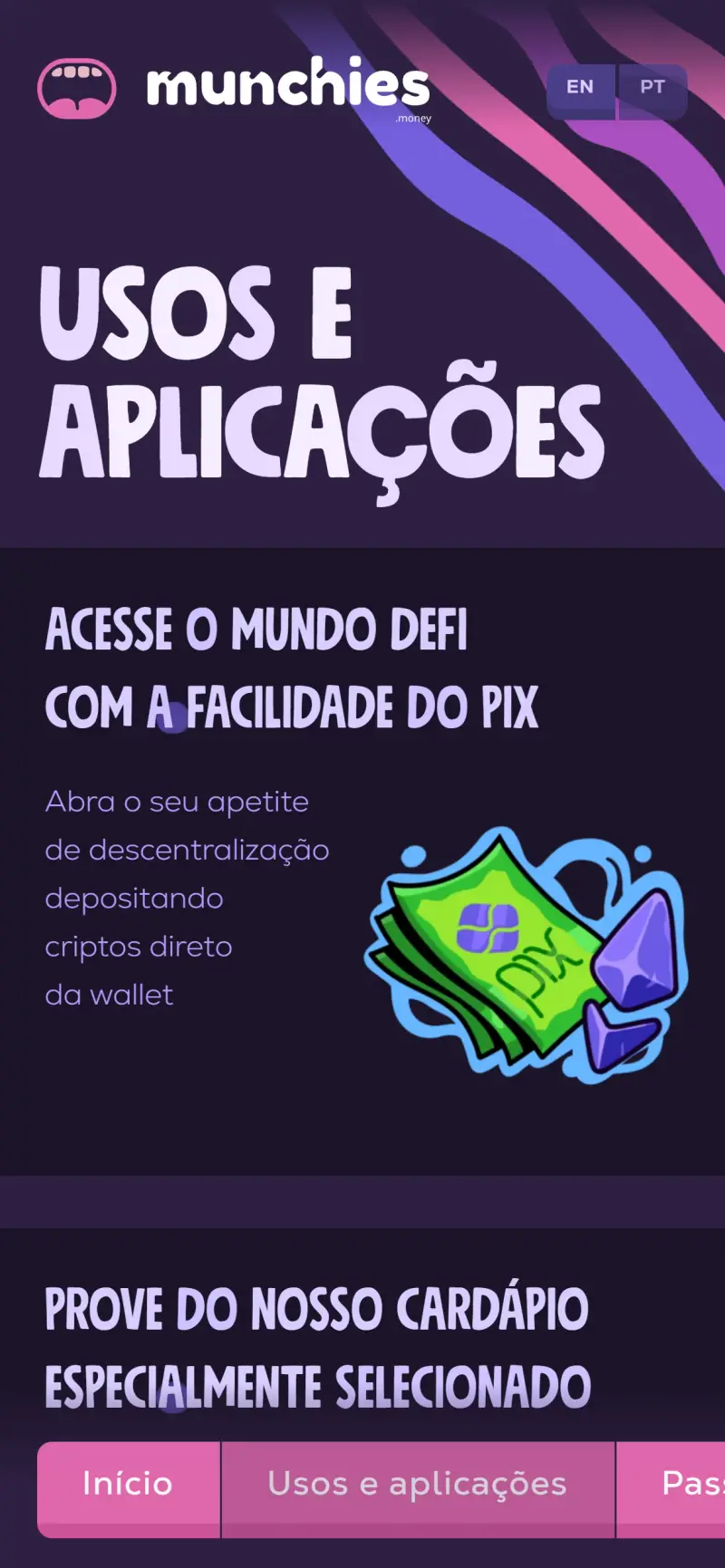
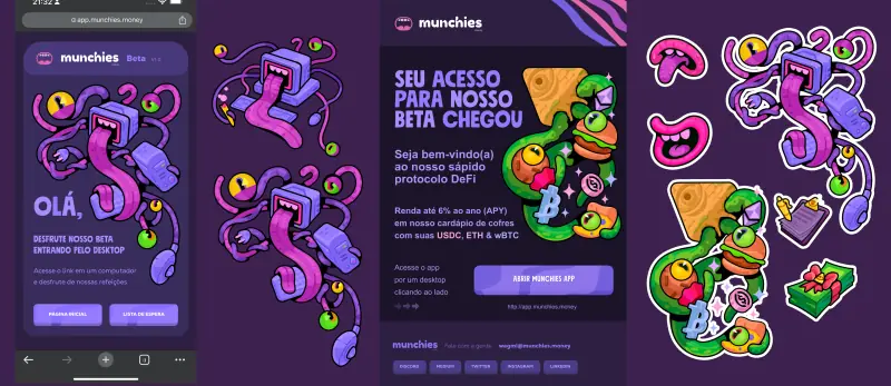
The beta invite, on mobile and desktop.
A menu instead of a chart.