

Skip to content
PTLet’s talk

Miss Coco

Project
Brand from scratch
Scope
Identity, packaging, 3D, campaign, online store
Deliverables
19-page brandbook, print manual, print-ready artwork, renders, posts and stories, live store
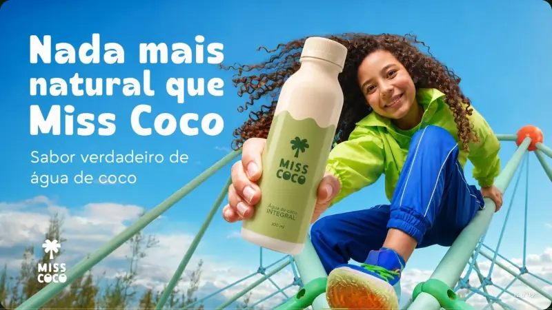
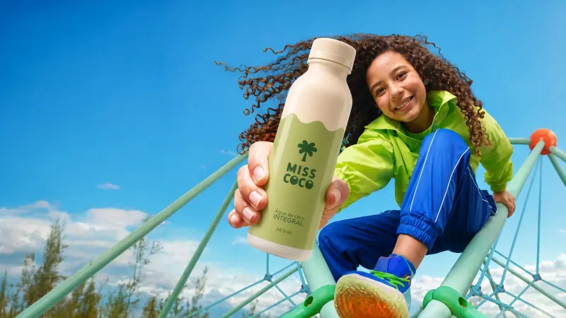
A girl on the climbing frame holds the Miss Coco bottle out to the camera

For Miss Coco, we started from a product idea. From it we made the concept, the identity, the label, the renders, the campaign and the online store.

Brandbook

We drew the brand and wrote the rules.

We built the symbol on a module, chose the type and measured the contrast of every color, all in a 19-page brandbook so anyone can apply the brand without us.

Brandbook17

Brandbook, page 1: cover, the cream palm on green
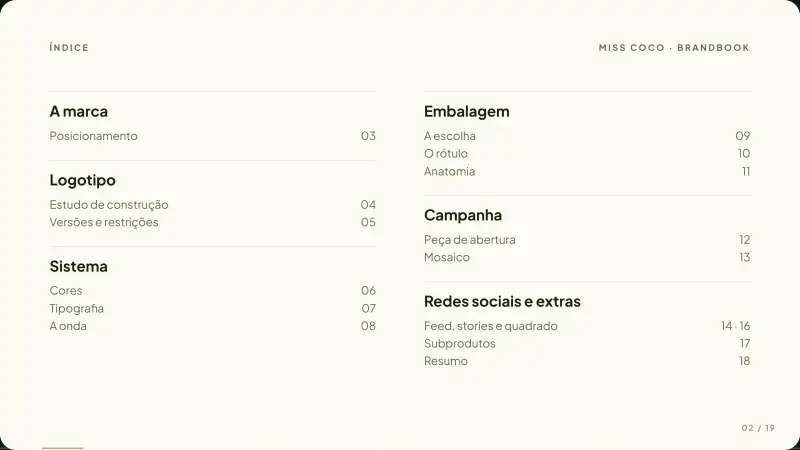
Brandbook, page 2: contents
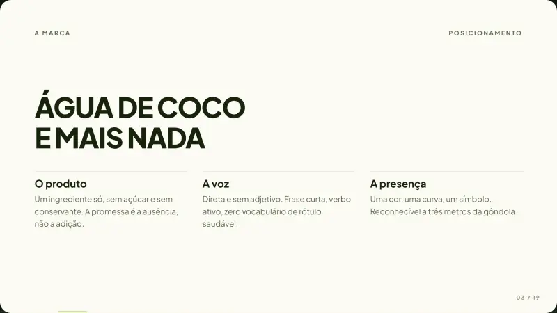
Brandbook, page 3: the brand, “Coconut water and nothing else”
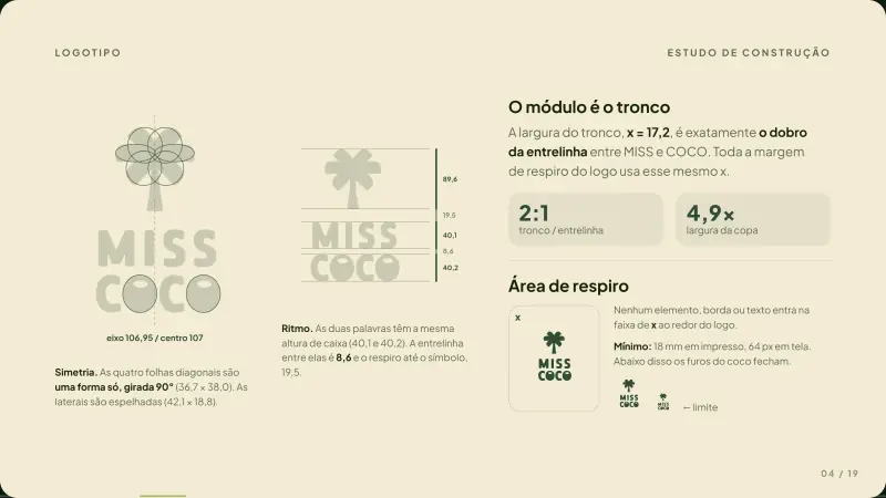
Brandbook, page 4: logo construction: axis, 2:1 module and clear space
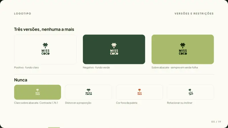
Brandbook, page 5: logo versions and restrictions
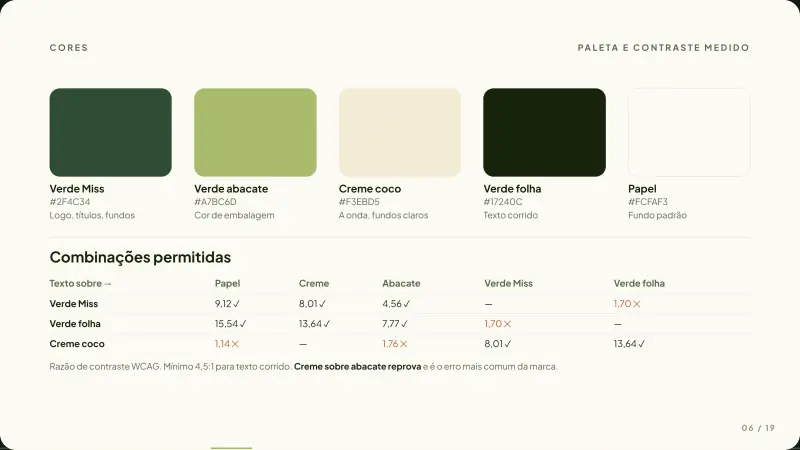
Brandbook, page 6: palette with measured contrast
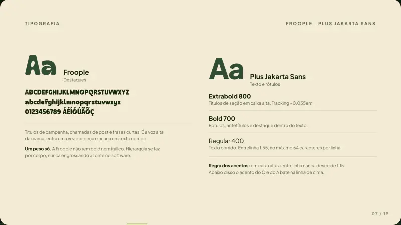
Brandbook, page 7: typography, Froople and Plus Jakarta Sans
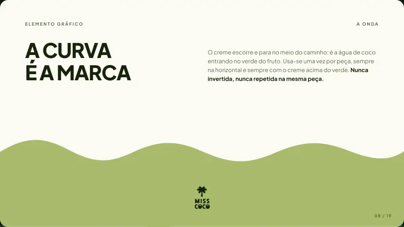
Brandbook, page 8: the wave, the curve is the brand
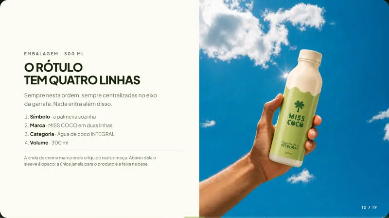
Brandbook, page 10: the label has four lines
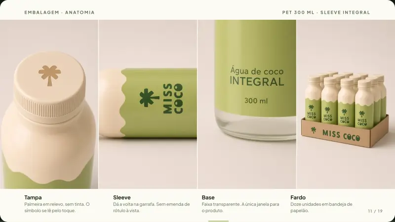
Brandbook, page 11: packaging anatomy: cap, sleeve, base and case
Brandbook, page 12: campaign piece
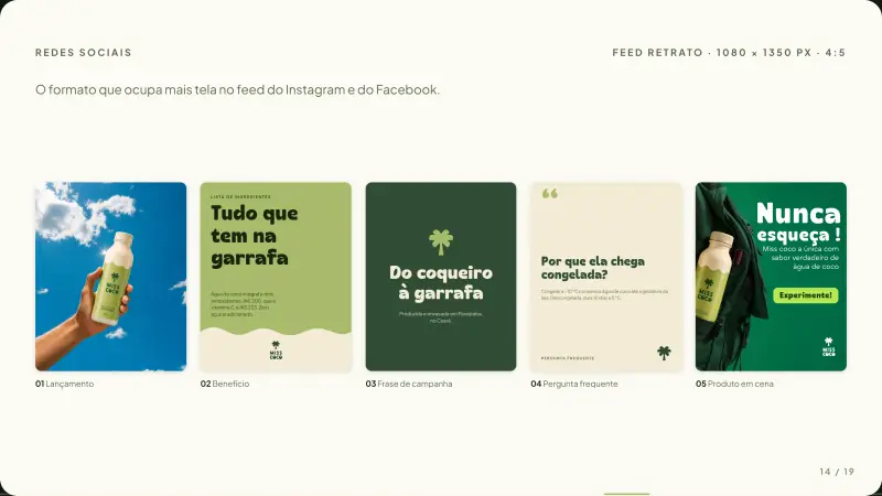
Brandbook, page 14: portrait feed templates
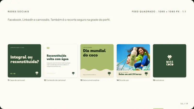
Brandbook, page 16: square feed templates
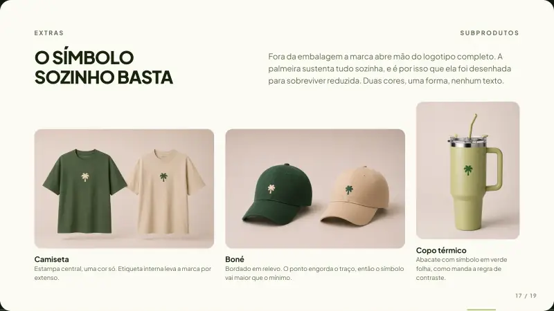
Brandbook, page 17: merchandise, the symbol alone is enough
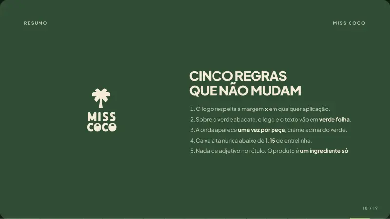
Brandbook, page 18: five rules that never change
Brandbook, page 19: back cover

Packaging

We took the label to print.

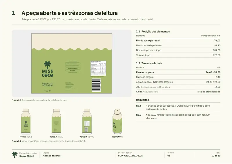
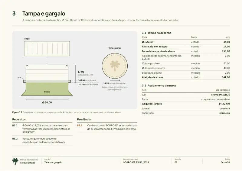
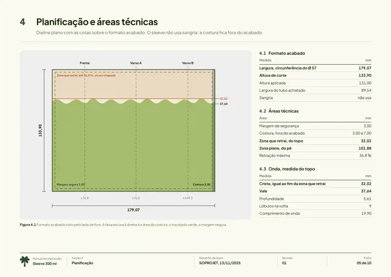
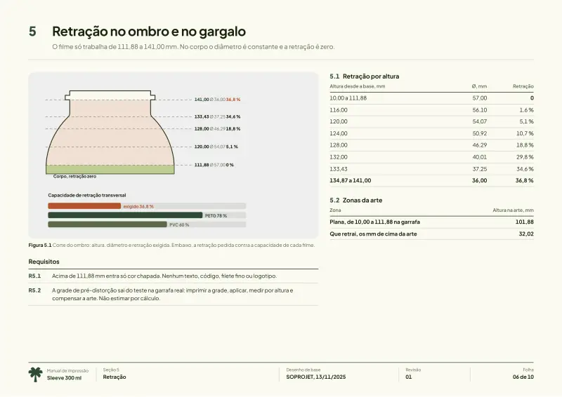
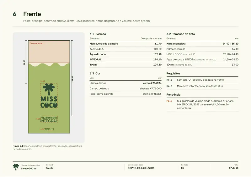
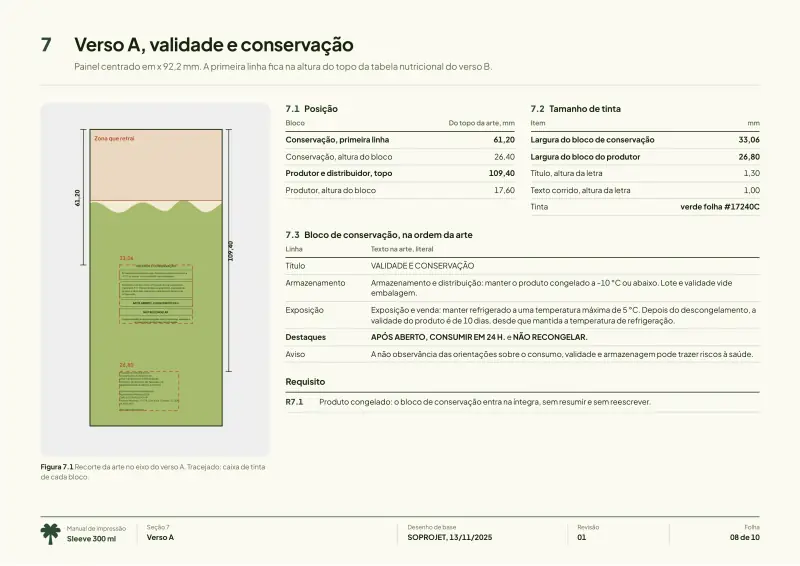
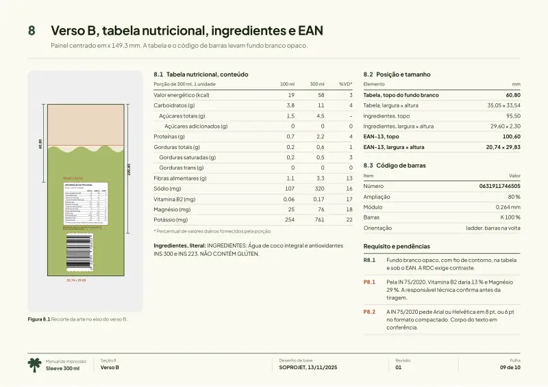
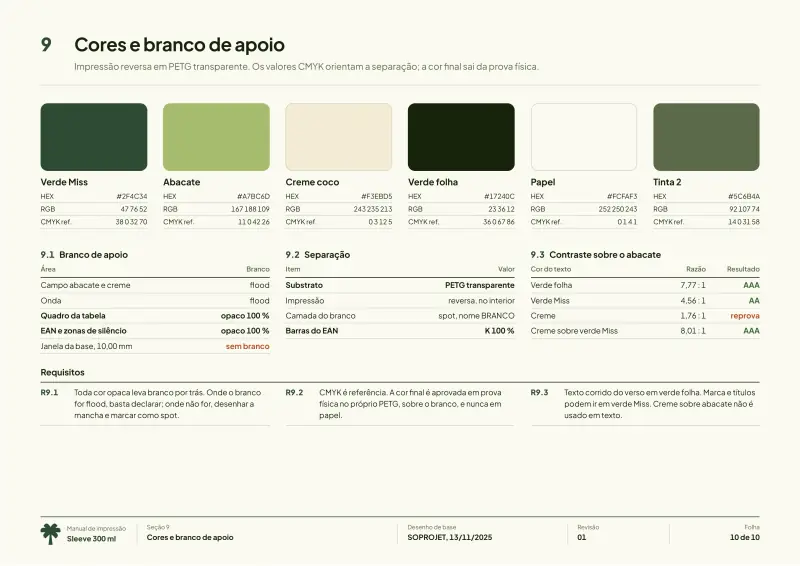
We designed the label, dimensioned the dieline at 179.07 × 133.90 mm and wrote the print manual that ships with the artwork.

Print manual, 10 pages10
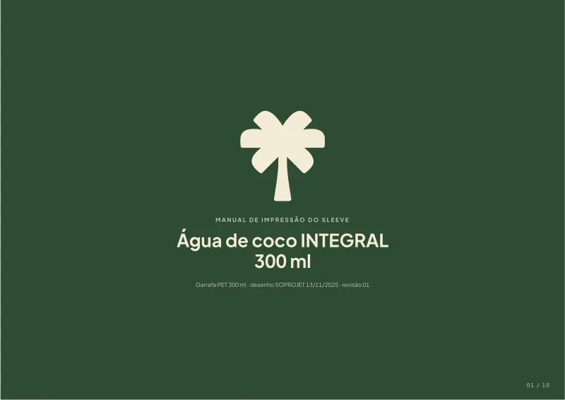
Label print manual, page 01
Label print manual, page 02
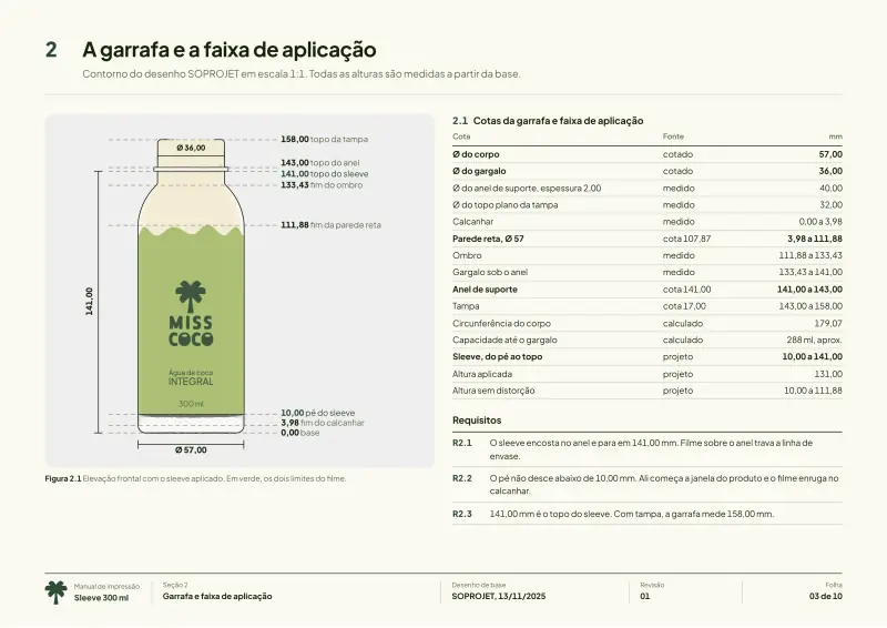
Label print manual, page 03
Label print manual, page 04
Label print manual, page 05
Label print manual, page 06
Label print manual, page 07
Label print manual, page 08
Label print manual, page 09
Label print manual, page 10
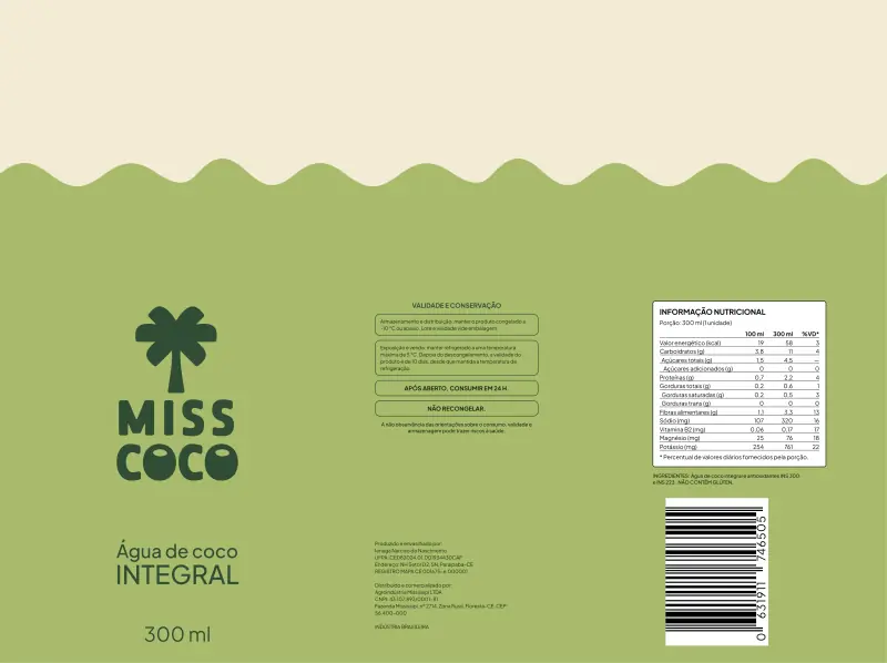
Print-ready label artwork

The final artwork sent to print, at 600 dpi.

3D

We modeled the bottle in 3D.

We rebuilt the bottle from the manufacturer’s technical drawing and approved every side of the label in render before it went to print.

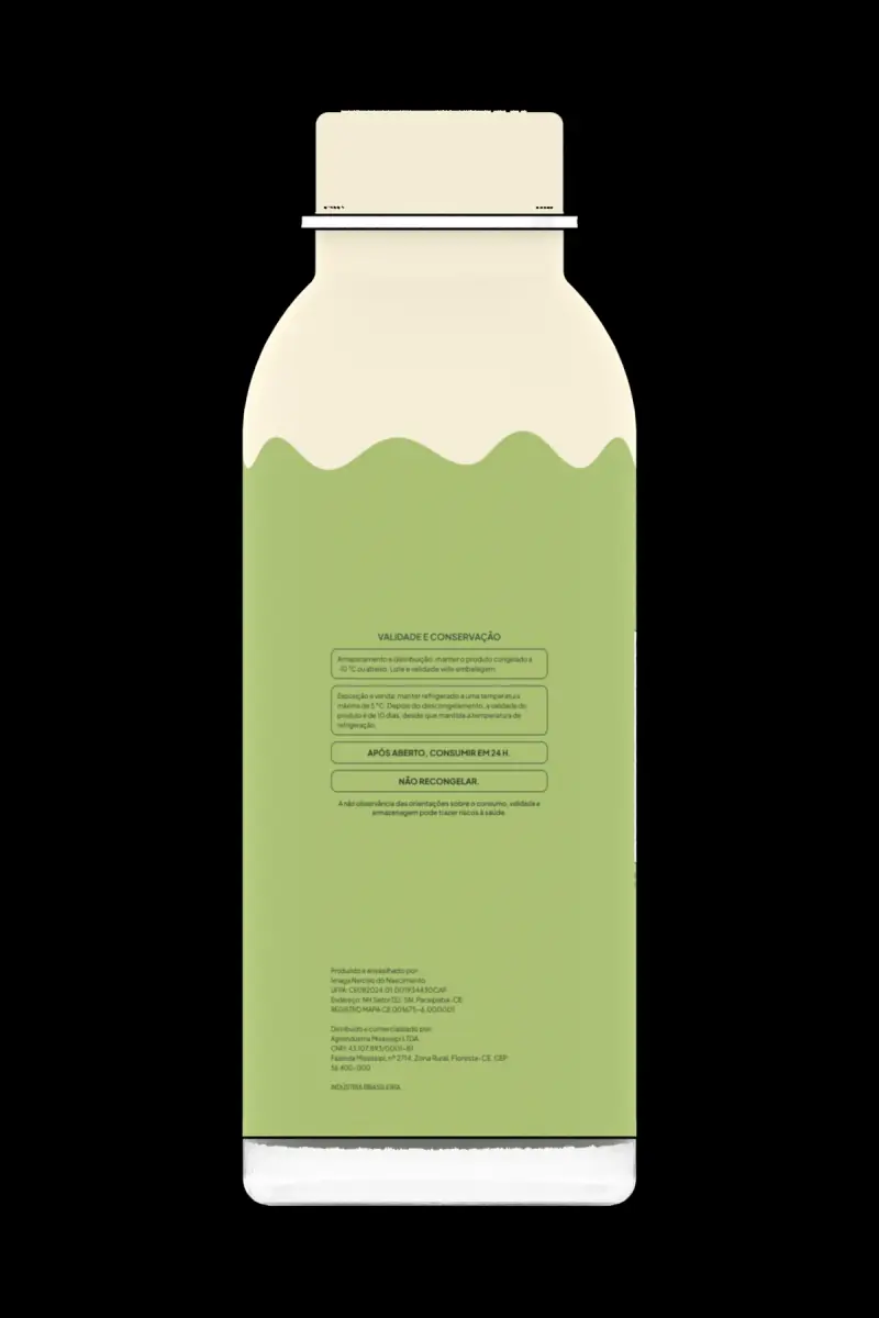
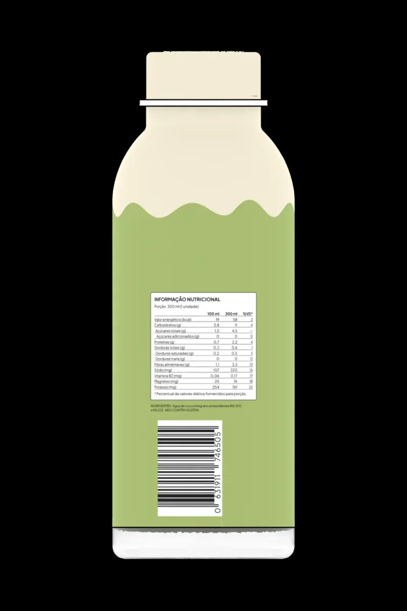
Technical views of the model03
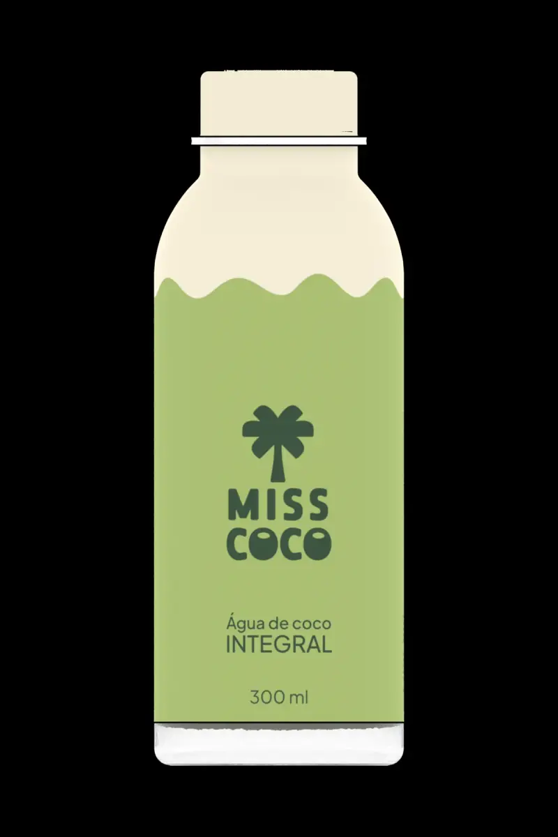
Technical view of the bottle from the front, on black
Technical view of the bottle from the side
Technical view of the back, with the nutrition table and barcode
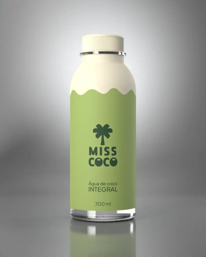
Studio render: the bottle from the front
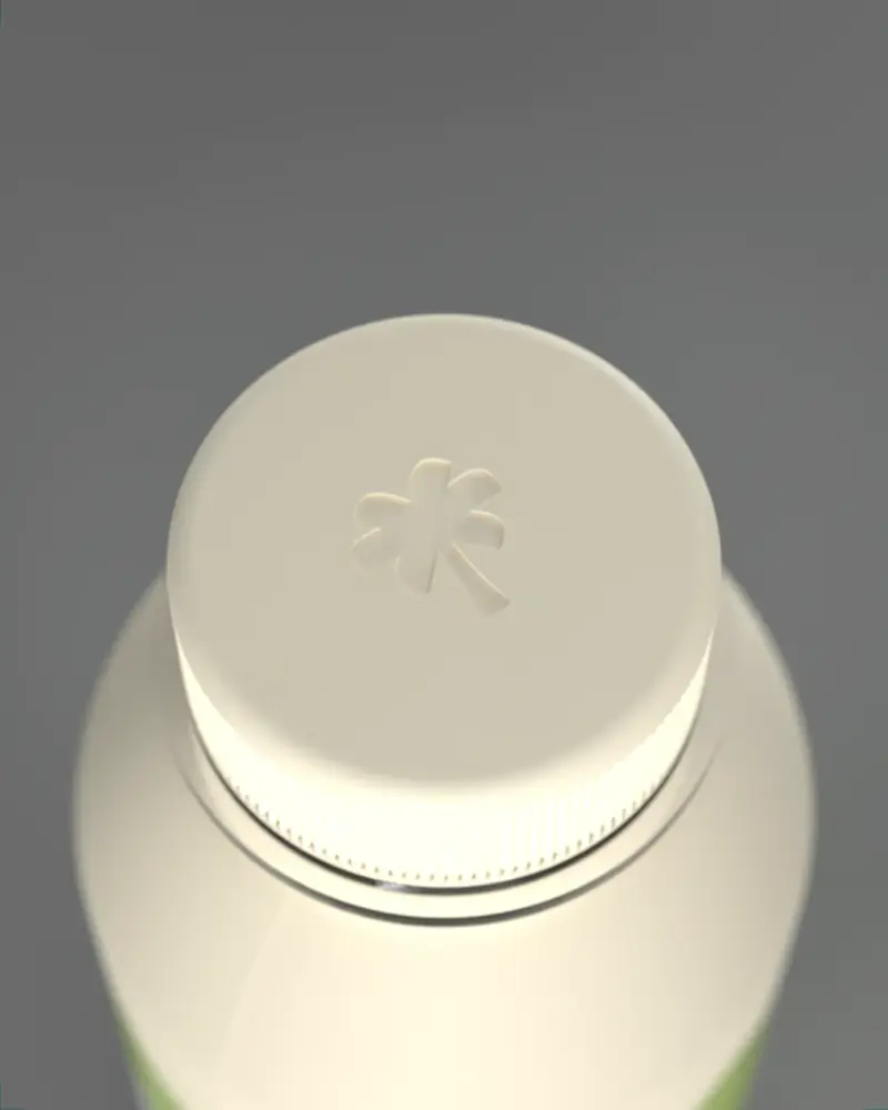
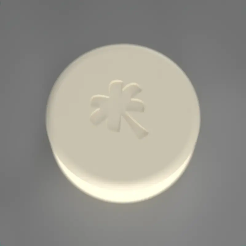
The cap from above, with the embossed palm

We approved the label and the cap in render, side by side, before sending them to print.

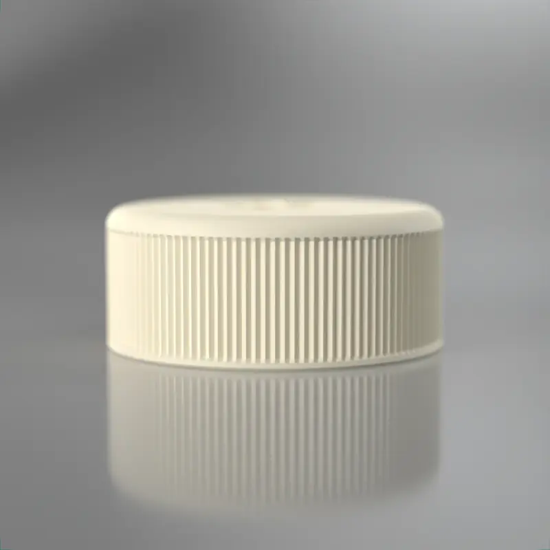
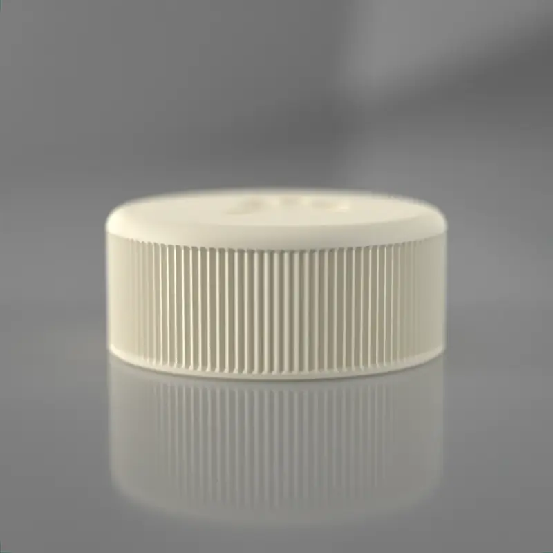
The cap: the palm embossed, no ink04
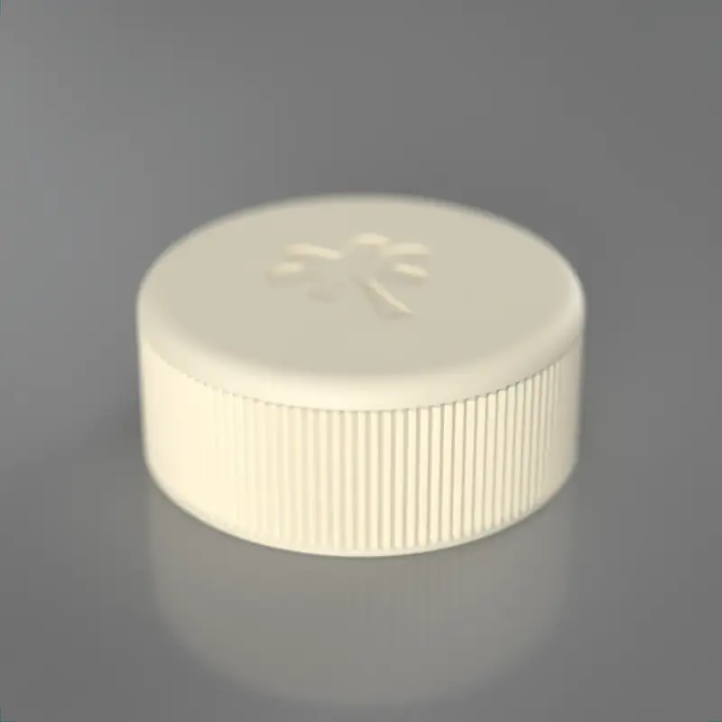
Cap study, three-quarter view
Cap study, top view
Cap study, profile
Cap study, the ridges

Campaign

We made the campaign.

We wrote and designed the posts and stories in the voice we gave the brand.

Feed06
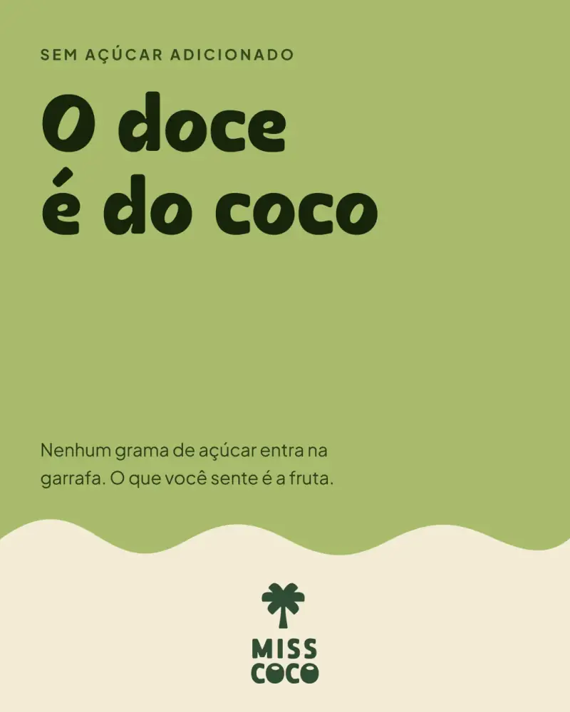
Post: “Sweetness comes from the coconut”, in avocado green
Post: “From tree to bottle”, with the palm
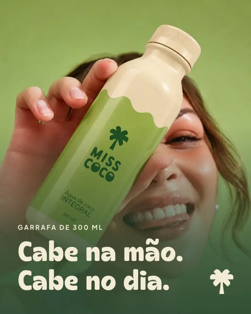
Post: a smiling woman holding the bottle, “Fits in your hand. Fits in your day.”
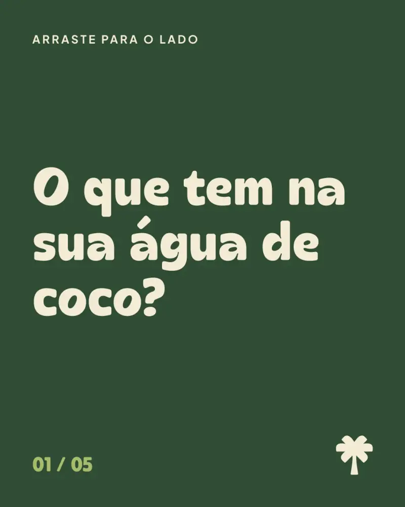
Post: carousel cover, “What's in your coconut water?”
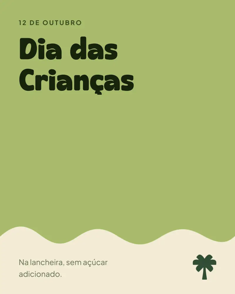
Post: “Children's Day”
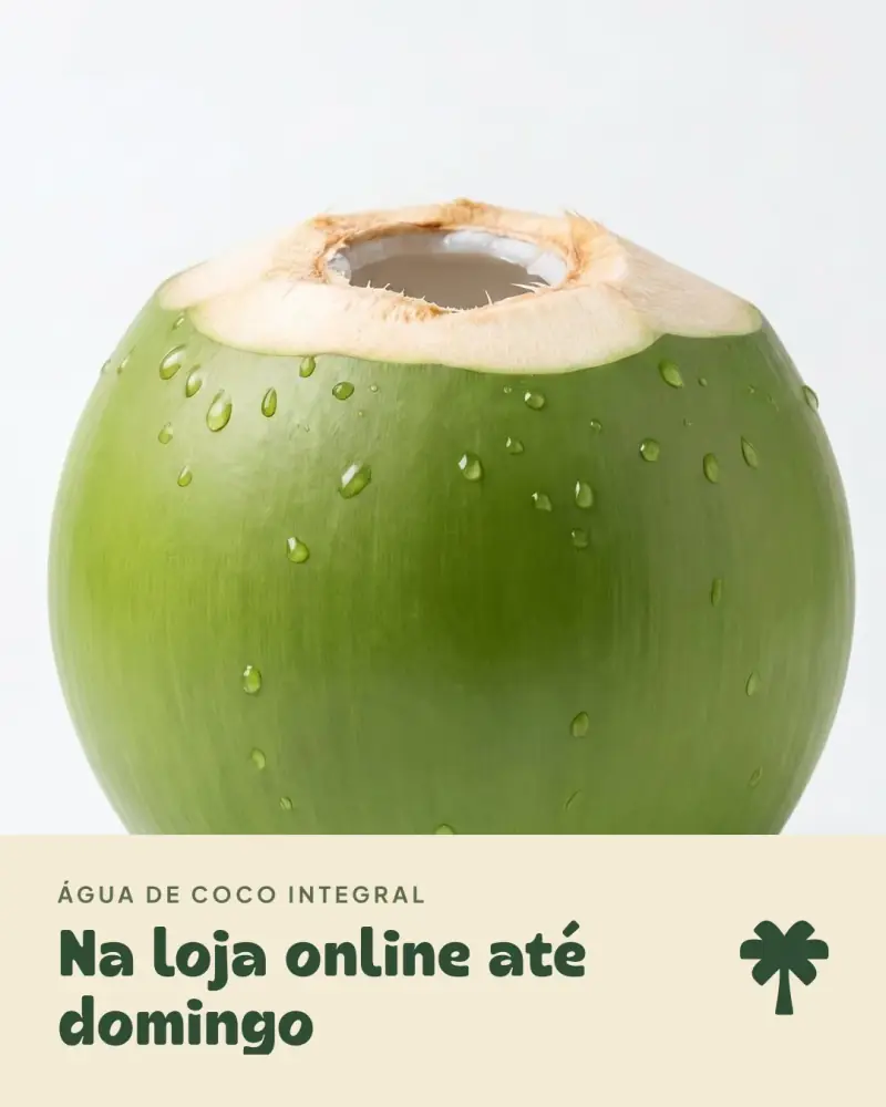
Post: a green coconut, “In the online store through Sunday”
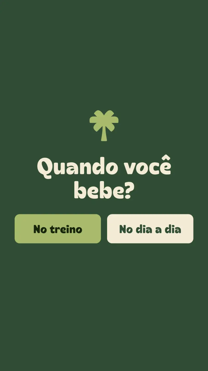
Story: poll, “When do you drink it?”
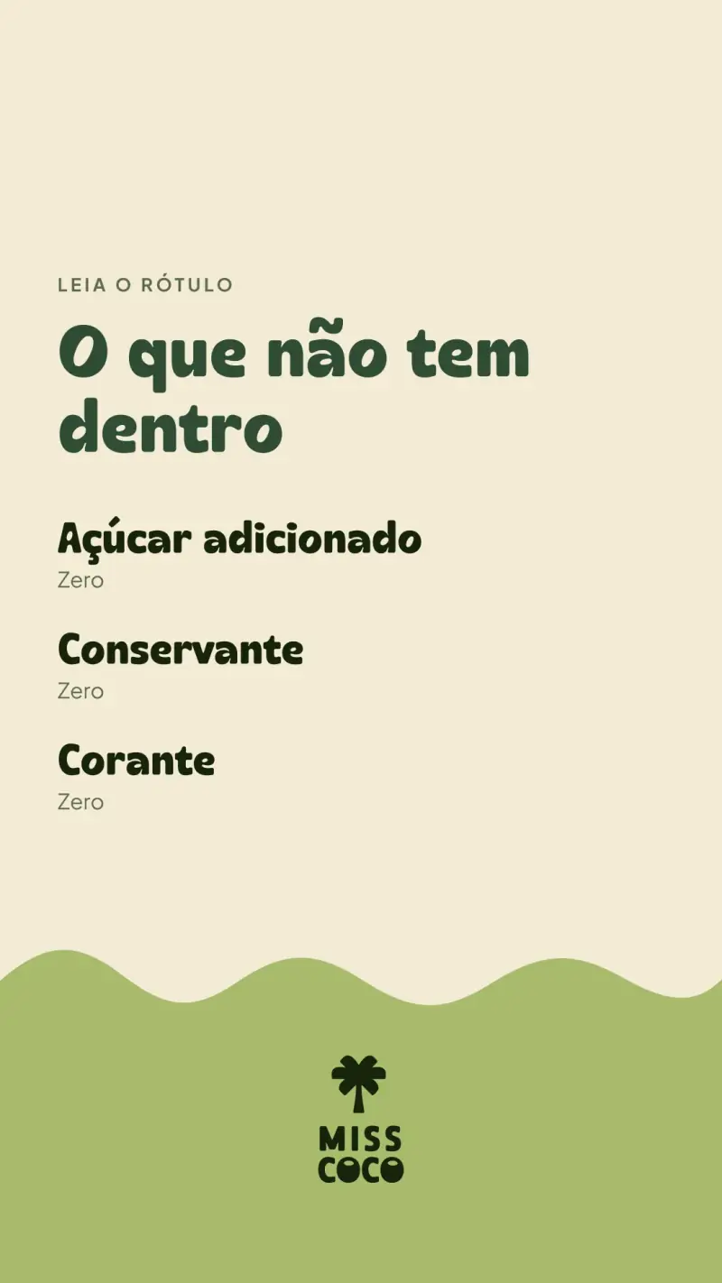
Story: “What's not inside”
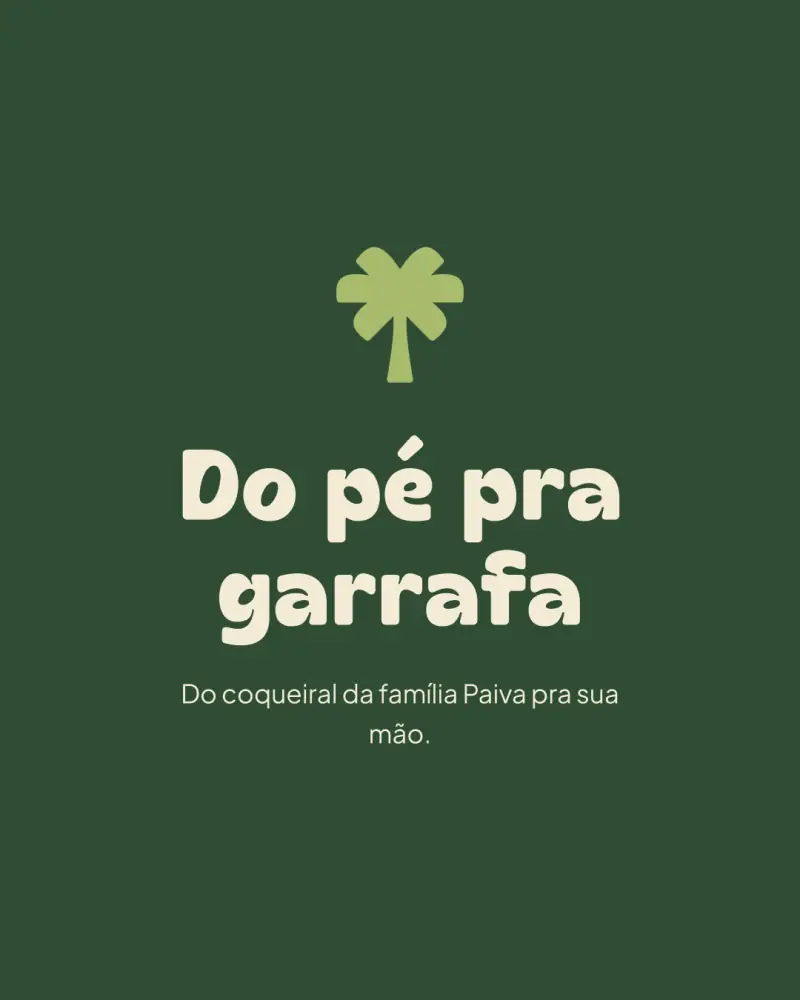
Story: the palm, “One ingredient”
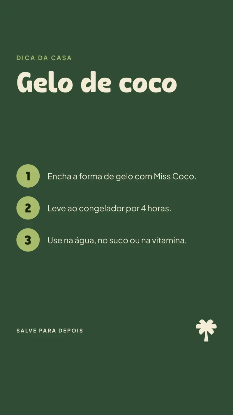
Story: coconut ice recipe

Online store

We took the store live.

We designed and coded the store, from the first scroll to the cart. The people who made the brand wrote the code.

The live store, browsed from the top to the cart, in real time.

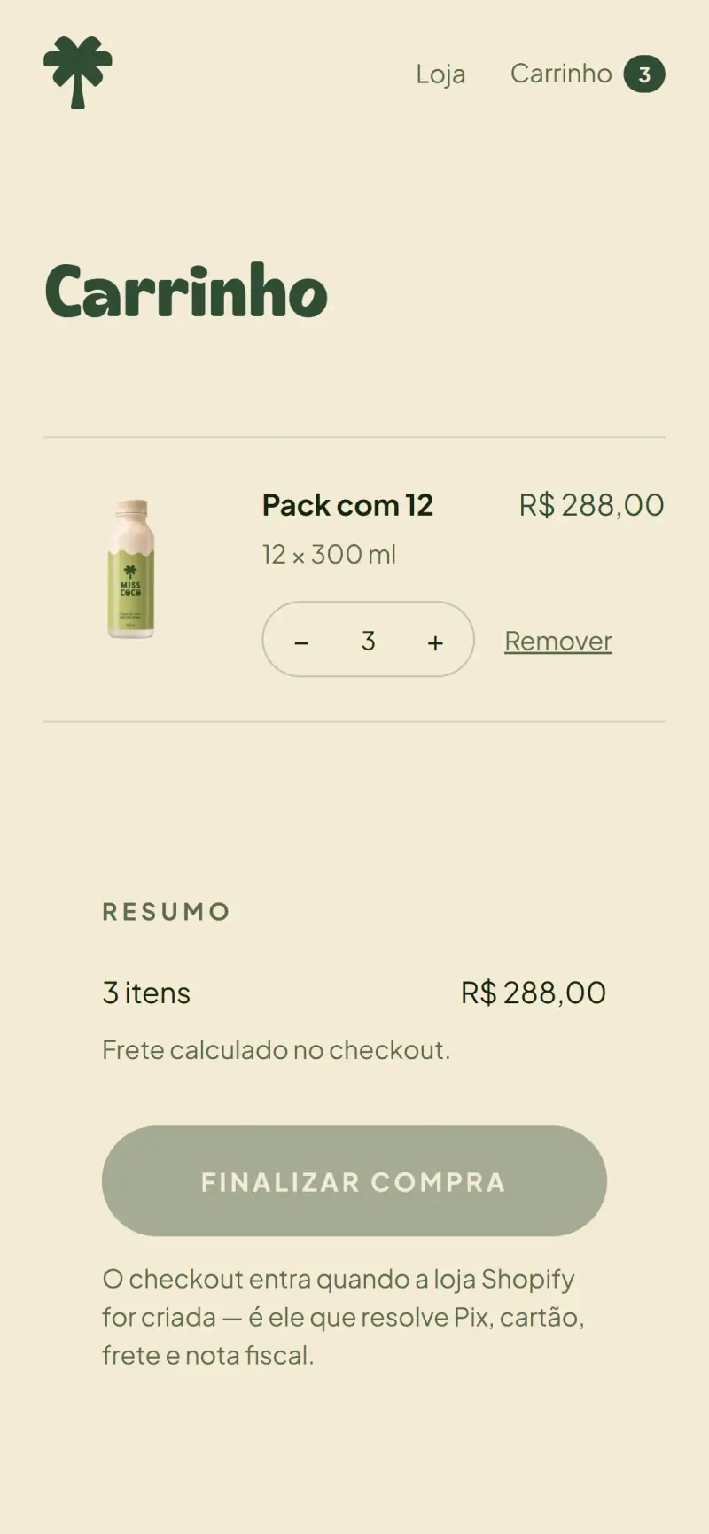
Cart with three 12-packs

Pick the pack, add to the quantity and close the cart: the whole purchase, designed and coded by us.

The videos we made for the store: the camera reaches the cap as you scroll, and the bottle turns in the showcase.

The same hands that drew the label wrote the cart.
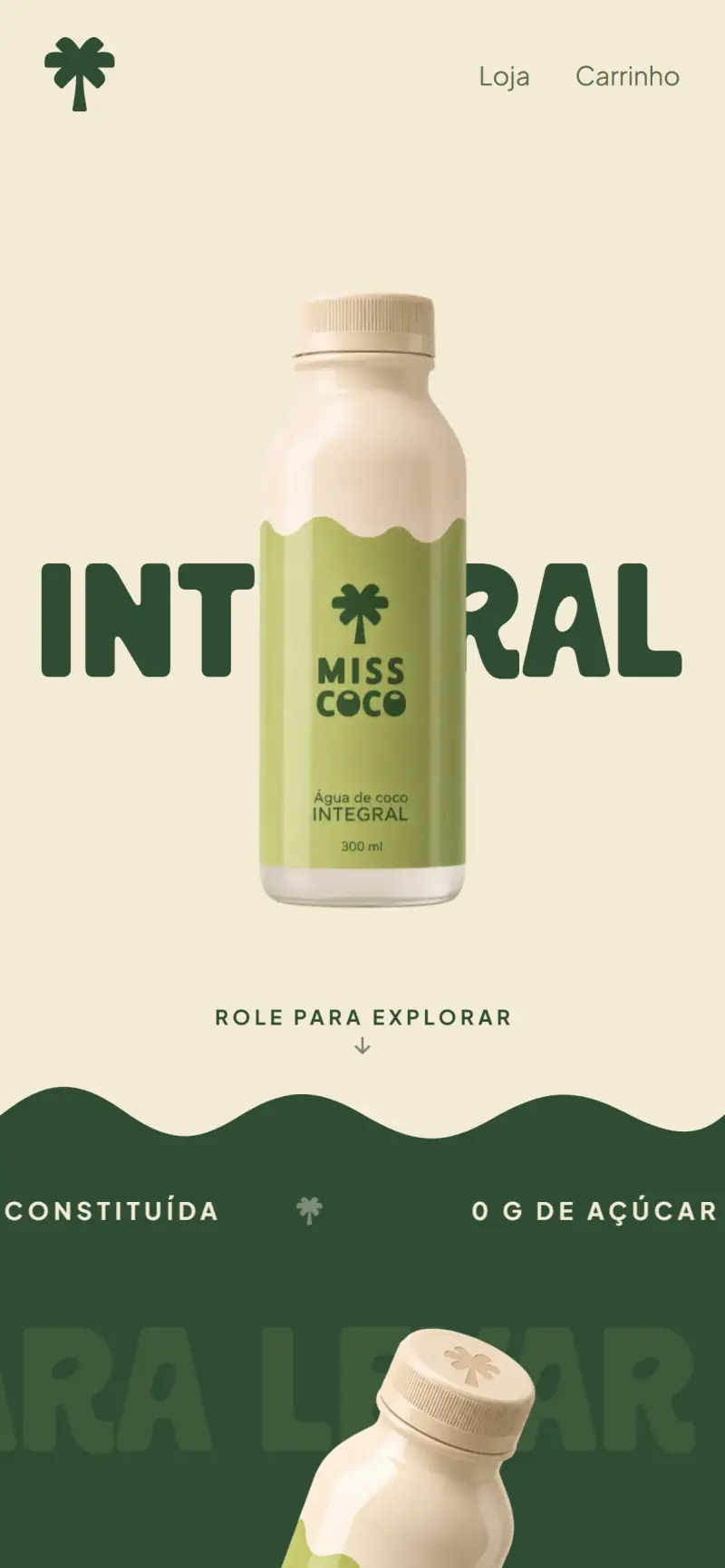
Store on mobile: home
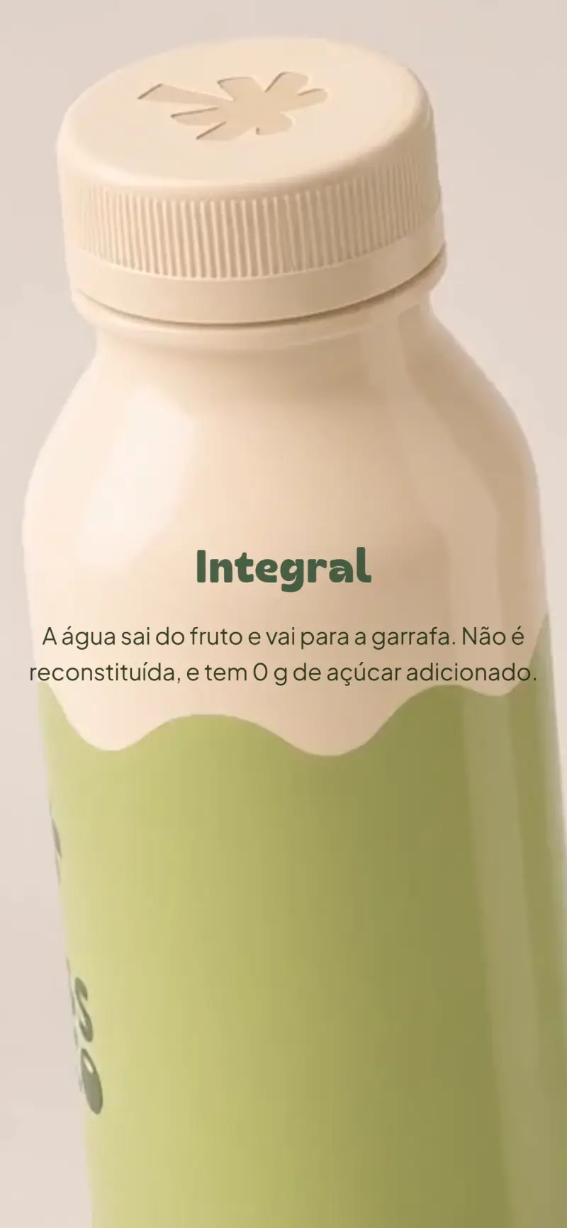
Store on mobile: bottle scroll
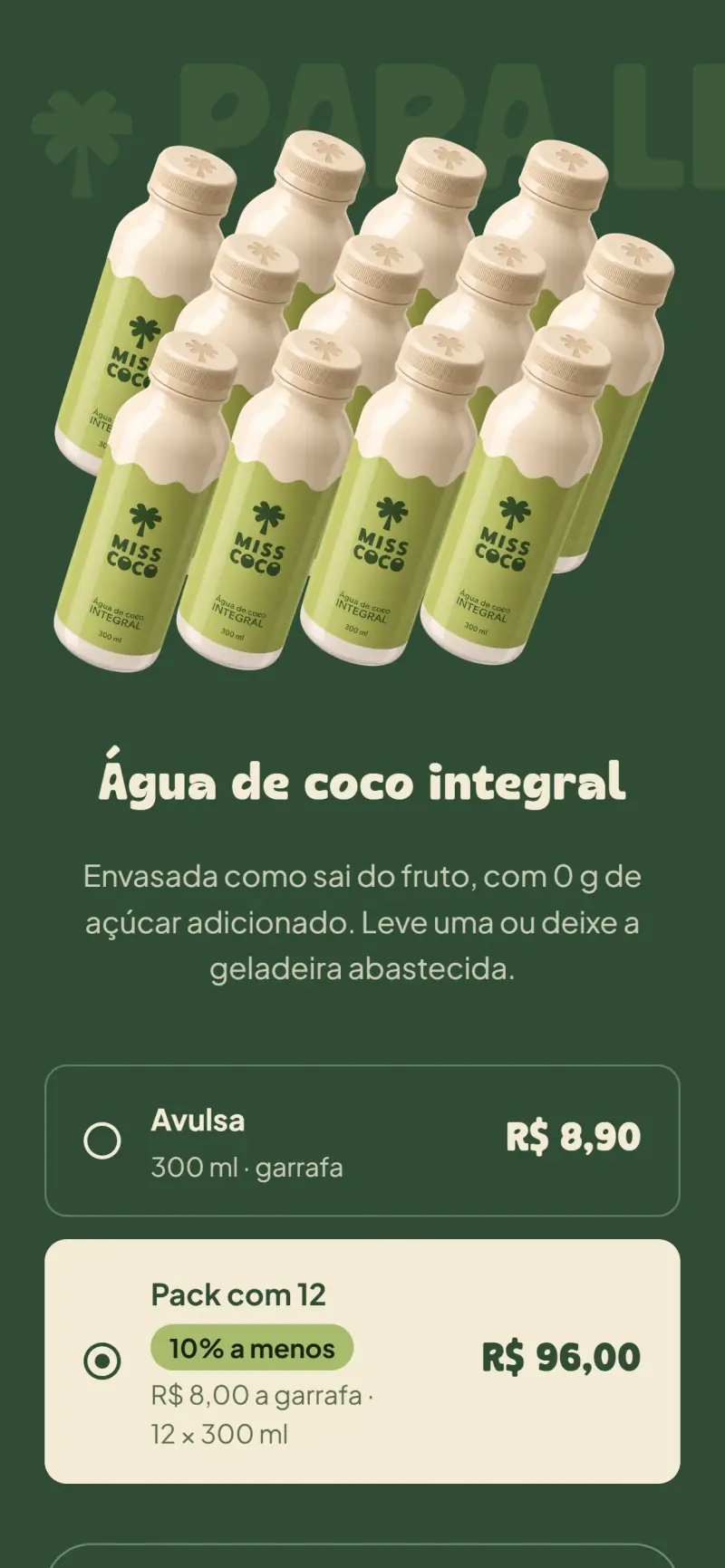
Store on mobile: 12-pack selected
Store on mobile: full cart
Next project03 / 04
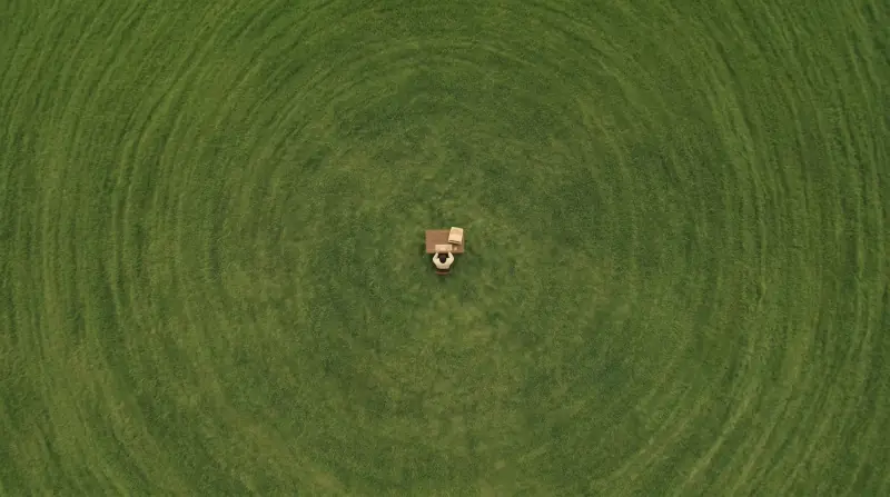
Aerial view of a green field with a desk and a computer at its center
VennaWe made the brand, the site and the launch film out of one open field.View project